Photo Critiqing Thread

Fergie

Expedition Leader
I am loving this thread.

Mainly due to the fact that I am severe case of red-green color blindness, so my take on things is slightly skewed compared to the rest of the world.

For instance, the bird photo; It doesnt blend at all! The bird is in stark contrast to the rest of the cacti.

Maybe that is why dad always took me elk hunting.

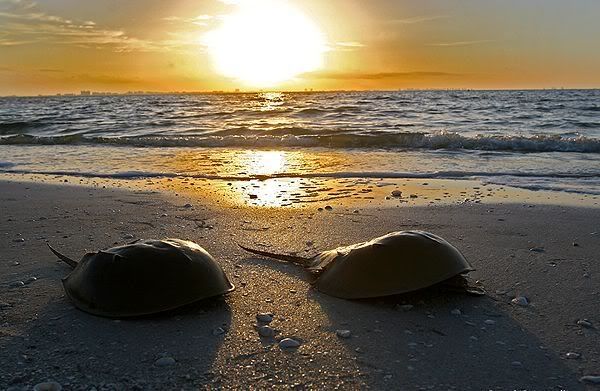
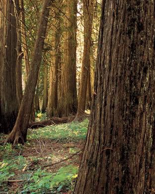
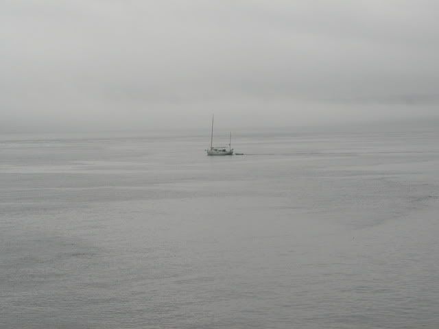
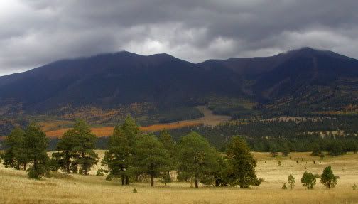
Here is one of my favorite photos that I took on the Sound:
wash1.jpg


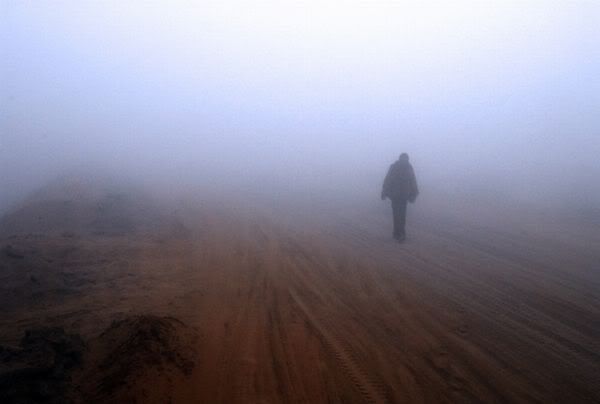
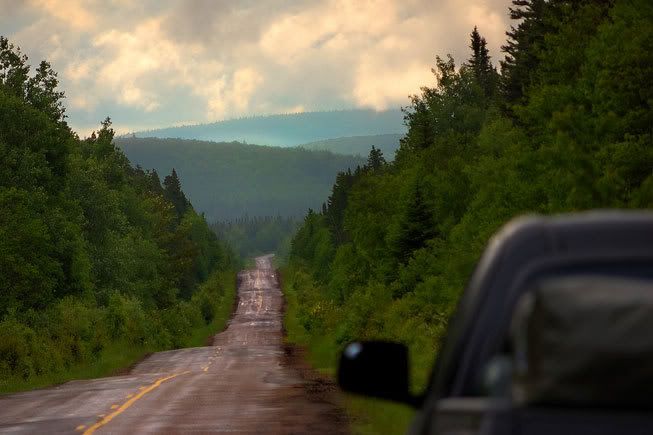
What can be done with something like this? It may not be a great starting point, but I'd like to know.


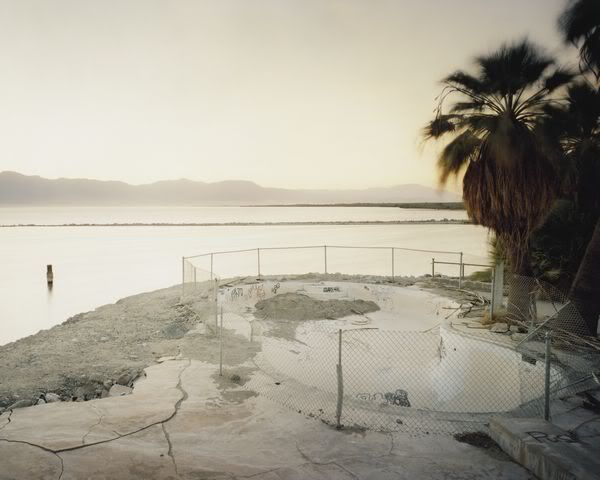
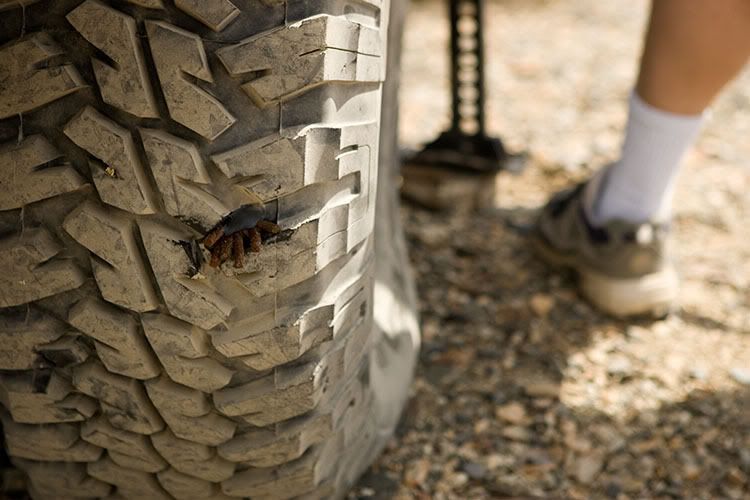
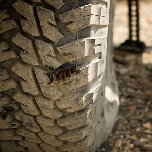
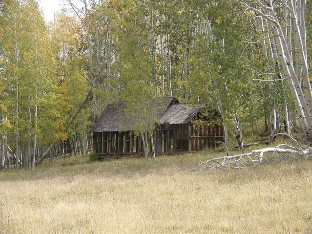
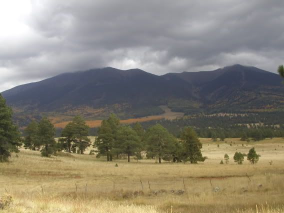
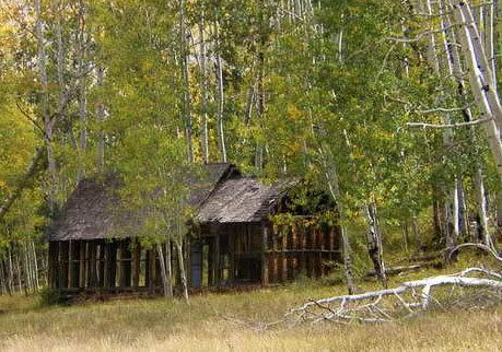
Here are two more that I always thought could have a bit more to them, but don't know where to start.
peak2.jpg

peak1.jpg
 

Ursidae69

Expedition Leader
Photog said:
As Mr. Woods said, I would make an adjustment layer, and and mask to warm up the bottom, and reduce the dynamic range a little. I will work on this a bit, and place it back in this post.

Dayum, nice work on that image Photog. I must learn these skills...
 

pwc

Explorer
Just a couple of quick takes.

In the first one I changed the crop to remove the vastness. While vast is good, the framing didn't jive with me for some reason. I added some black to it and removed all saturation.

The second one; I cropped the bottom of the picture which wasn't doing anything for me. This moved the house to the bottom third. I then jacked up the vibrance and brought down some of the highlights.

EGADS!! I just realized I exported them at the wrong size. sorry for the pixelation. I'm obviously tired.....
 

Photog

Explorer
Here are my two cents.

Don't place the subject in the middle of a photograph.
Zoom in or crop the photo, to increase the size of the subject, unless you are trying to make the subject diminutive.

I would have cropped the boat like PWC; but place the boat low in the crop, and only if sky was dramatic.

Adjustments: Changed black point, cropped and placed cabin lower left, because sunshine is coming from right.
Cabin2.jpg


Removed all color (desaturated), cropped to tight horizontal, allowed more space above boat than below, alloed more space in front of boat than behind, modified light/dark areas to bring attention to the boat. The boat is still fairly small in this crop. I like it that way, because the ocean is huge, and boats are small.
Sail-boat2.jpg


Cropped to eliminate distractions on left & right. Cropped to remove bright spots on top-left and bottom. Changed black point, added saturation, and added slight brightness to grass to give effect of a break in the clouds. Also modified curves to increase contrast.
peak1a.jpg
 
Last edited:

Photog

Explorer
Here are a couple Rules of Thumb (whoever Thumb is).

1) Give your subject a little head room.

If it is a flower, cabin, boat, person, dog, etc., leave a little space above for them to move/grow. When this rule is violated, the viewer feels crouded, or pressed down.

2) Give your subject a place to look.

If it is a subject with eyes, and the yeys are not looking intothe camera, make sure there is a little more space in the photo, in the direction they are looking. Sometimes architecture photos have this feeling, due to the direction of light.

Consider the way I cropped the pictures in the previous post, based on these ideas.

Now don't forget: Rules are made to be broken. If you don't have any head room for a person, cut them off, right through the forehead, and come in close.
Well, it's just an idea.:)
 
Last edited:

Lost Canadian

Expedition Leader
I would like to expand this thread a little. I think the question of what makes a good photo should be looked at a little deeper. I'm curious what the folks here would do to these? Be honest.


ocean.jpg

fog.jpg

pool.jpg

MR_9715_4.jpg
 

Photog

Explorer
Lost Canadian said:
I would like to expand this thread a little. I think the question of what makes a good photo should be looked at a little deeper.

Good thought. By critiquing existing images, can learn how to improve the next image we make.

Many things that make an image look good, are based on how they make you feel, subconsiously. Things like: Rule of thirds, head space, direction of vision, color of light, weight at the bottom, vertical power, horizontal relaxation, diagonal dynamics, your eye is drawn to the brightest areas first, then contrast and sharpness, etc. This all assumes the technical parts are done well: focus, exposure, depth of field, etc.

I certainly don't claim to be the photographer with the most wisdom; but the ideas listed above, make for the basis of most great photographs.
 

pwc

Explorer
On top of Brian's comments about technical aspect I'd add; emotion. Emotion and connecting with the subject makes a big impact on what a good photo is. Since "what good is" is an individual taste, individual emtion matters a lot.

Take your last 4 images. I like them, they are cool. But the last one made me think "Hay! I took just about the same picture in the Redwoods" and now I'm sitting in my unlovely cubicle with a chance to escape to a family trip two years ago to California. So I liked that picture best. Is it technically the best? I'm sure that can be picked apart. Right now, I like that one the best because I totally associate with it.
 

pwc

Explorer
Trevor, I took a quick look at your site and really like your work.

Case in point for what makes a good photograph.
This image from your site can use some technical adjustments but I don't care cus it speaks to me of the open road (once again, where I'd rather be than in a cube)
Show this same picture to someone like my Dad and he might say "why'd you take a picture of a road? couldn't find a moose?"
Good1.jpg
 

Photog

Explorer
pwc said:
On top of Brian's comments about technical aspect I'd add; emotion. Emotion and connecting with the subject makes a big impact on what a good photo is. Since "what good is" is an individual taste, individual emtion matters a lot.

Excellent point of discussion. :clapsmile

This is a subject my photographer friends and I, have discussed many times. My example to them is usually about photographing shooting sports, or golf, or expedition travel. For example, it has been my belief that the best photographs of golf would be taken by a good photographer that also plays golf. They will create more images that a golfer would respond too.

The example you gave about the "Open Road" image, is a prime example. It tugs at those of us that explore roads to the ends of the earth.

Now, take the "rules" mentioned earlier, and apply them to the same situations, and the photographs are still enjoyed by people with some connection to the photo; but also by people that may not have a connection; simply because all aspects of the composition are pleasing, at a subconscious level.

I believe that the folks on this forum, that are also good photographers, are able to produce photographs of expedition travels, better than the typical professional photographer would, on the same trip.

Does that make any sense?
 

Photog

Explorer
Having just been to the Redwoods, these photos should give you an emotional reaction. The adjustments I have made, are the types of things I would do to make it tug at a wider audience. I'm sure a forester would have a different emotional reaction than a city dweller. What I want is for them to both have a positive reaction. You are correct about having an emotional connection, it means a lot in a photograph (just look at all the snap-shots of our kids).

Blue tones feel cold. The tree on the right seems to be the subject; but the background is brighter, and demanding my attention. My head struggles to determine the subject (not always a bad thing; but it usually is negative).
MR_9715_4.jpg


I cropped most of the near tree out, to allow us to travel back into the image, to the lighter area, which is definitely the subject. I reduced brightness in the lightest area. I added a little brightness back into the forest floor, for us to have a path into the photo. I warmed up the image to make it more inviting, by reducing the blue (like an 81A filter would do). Seems a bit too yellow, but it mught just be your brain comparing the color to the blue tinted photo above (blue comes from the sky).
MR_9715_4a.jpg
 
Last edited:

Photog

Explorer
Here is one idea, for adjustments to the "open road" photo. By the way, I loved this image before working on it.
Good1a.jpg


Someone pull one of your own photos up, crop it for composition, modify the color of light, contrast, shadows, etc., and show us the before & after. Lets have some fun with this.:wings: I'll stop Photochopping other folks images.:rolleyes:

Here is one, as shot:
IV8E0204.jpg


and, as modified: mostly cropping, and a little dodge & burn.
IV8E0204c2.jpg
 
Last edited:

Lost Canadian

Expedition Leader
The reason I chose the above images is that they are images that were chosen as some of the top images by the Lucie Awards people, think Oscar equivalent in the photo world. As someone relatively new to photography, and as someone who is trying to understand not only the rules, but what truely makes a good photo these really jumped out at me. Why are they good, and what makes them so good that they should be nominated as some of the best photos of the year.

An empty dilapidated pool, a couple horseshoe crabs on the beach at sunset? I find these choices intriguing and provocative. I mean, of all the over saturated, over processed HDR, photoshoped marvels out there, these seemingly uninterested photos are what is considered great.

It made me wonder that perhaps in our critique of technique and color here, we may do the shots injustice by changing the intended message and feeling. Take the boat shot for instance. To me it is more aesthetically pleasing to crop the shot a little and desaturate it, but what if the intended message is that of vastness. By cropping it down we totally change the feeling of the shot. By trying to improve upon a picture technically can we, or do we also subtract from its intended feeling and/or message?

It's certainly interesting, this crazy world of photography. As an art fan I've always been intrigued by the so called "deeper perspctive." Salvador Dali's work comes to mind as an example of what I mean.

Anyway I'm rambling, good thoughts and comments guys!
 
Last edited:

Photog

Explorer
Trevor,
These are good questions.
Many photography competitions have diffrent catagories, such as: sports, photojournalism, landscape, astronomy, child photographer, medacine, portrait, architecture, etc.

Many times, there is a theme, for the overall competition. Or there can be a request for one image, that would describe a word, like: Despair, loneliness, etc. A photo may define the word perfectly; but it may not be something you want on your wall at home.

There is a brilliant photo, taken after the Oklahoma City bombing, of a firefighter holding a child. Great photojournalistic image, very powerful. It tells a story, and brings many people to tears (me included). It is well focused, the subject is clearly defined, the exposure and color are perfect. If these things were not done properly, it would distract the viewer from the story.

Some images don't stand alone very well; but when you can put a few photos together, each one may become more powerful.

The forest photo above, may have been chosen, because it was part of some idea, that was being promoted. Maybe something to do with old growth or bark beatles? I don't know.

When a photo has to stand on its own, without context, many photos can't pass muster. Just like many of the films at the film festivals. The insider-artists think a film is fantastic; but the buying public won't spend $3 to rent it. So was it really great? Sometimes yes, sometimes no.

If you decorate your garage or den with expedition photographs, you would probably have some subjects that seem odd to other people; but if the photographs were created with good photographic techniques, they might still be appreciated.

I hope this helps make sense of the "winning" photos posted earlier. It would be great to find out the context of those winners.
Here is a link to the Lucie Awards, that tells a little about their catagories. The "Old Pool" image, may have been part of a "documentary" group of photos, on someplace like Lebanon.
 
Last edited:

Forum statistics

Threads
187,464
Messages
2,894,823
Members
228,400
Latest member
rpinkall1

Members online

Top