Photo Critiqing Thread

photoman

Explorer
Clark- I'll share my thoughts on these images of yours from Chevlon Lake
HDR1-L.jpg
This image a pretty nice scenic shot. The light and the detail along the lower left is strongest area of this image. The sky and the background is pretty washed out which detracts from the overall feel. In post process you could enhance the sky a little bit and boost your greens to make this a bit more dynamic.

Similar to previous shot the lower right is the focul area and where all the detail is. I would like this to be a little wider so you can see the entire tent rather than some of it being cut off. The dead tree at the top right is a little distracting and much like the first shot the sky and trees could be enhanced to help balance the image.

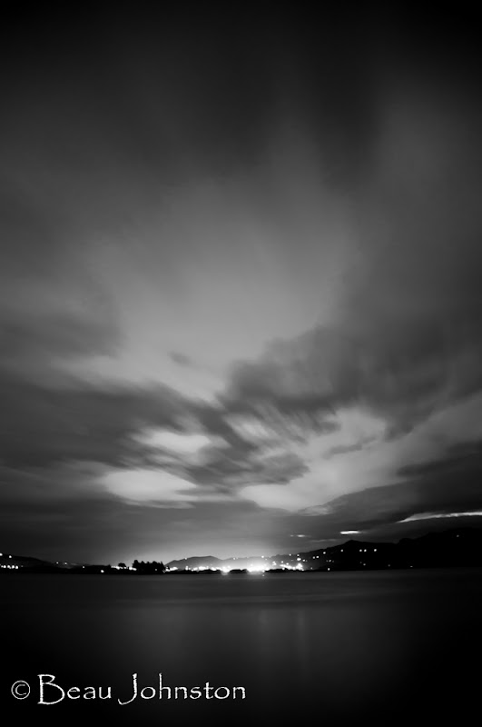
First of all great work on getting the exposure correct on the tent light. The sky has just enough movement to be very interesting. This is a shot where painting with light would have made a huge difference. By taking a flashlight or headlamp and lighting the outer edges of the tent the shot would be so much stronger.


This one is just a snap shot and not a lot to work with here. The sky is blown out and the contrast between light and shadow are too much to overcome on this shot.

Looks like a great little trip though.
 

nwoods

Expedition Leader
I echo Aaron's comments. Images 1 and 2 are too flat for me. That is more a product of the light you had to work with, rather than anything you did or didn't do with the setup. I would like to see what could be extracted from the original file if don't mind emailing it to me. "nathan" at "woodsfamily" dot "cc" (not .com).

Photo 3 - night shot. My favorite shot, it's really good, but, this image would be infinitely better with your girlfriend in the tent to add interest and humanity :)

Photo 4 - just not working for me at all.
 

photoman

Explorer
I did just a real quick edit in PS. File was only 149kb to start with but it gives you an idea of what a little bit of post processing can do.

I increased saturation on green and cyan. Did a little dodging and burning on the skies and trees, and a slight crop to eliminate the tree in the top right.


i-wZHT73P-L.jpg
 

Clark White

Explorer
Thanks guys! The two of the lake are actually HDR images, so there is indeed more information in the sky, I just need to work on how to extract more from the composite. I used Photoshop CS5 to make them, should I stick with that or is there another program that is better for HDR?

It actually makes me happy to hear you guys say that I should be increasing saturation a bit, my room make (who is normally the one looking at my pictures) likes them much flatter, so I had begun to believe that I was over saturating them.

nwoods, I sent you an e-mail with the two images in JPG format. I could probably upload the original NEF's to my smugmug if you really wanted to play with it that much.

Thanks again!

Clark White
 

048642

Adventurer
Was wandering around the other day and came across a flower farm.
 

Attachments

  • ImageUploadedByTapatalk1319592460.358287.jpg
    ImageUploadedByTapatalk1319592460.358287.jpg
    1.6 MB · Views: 16

Mr. Leary

Glamping Excursionaire
So I'm not very good at this yet. I noticed this rock arrangement while in Carlsbad Caverns, and it looked pretty cool, neat 3D kind of perspective.

So, why is this photo just "meh," and not "sweet"?

(Please be gentle) :)

IMG_2125FC_RockBW2.jpg
 

nwoods

Expedition Leader
I think of two reasons.
1. The composition doesn't give a good perspective of scale. I can't tell if this is no bigger than my shoe, or is it 40' tall and looming over you? It needs something to add context so that I can appreciate it better.
2. Lighting. I think you could boost the exposure setting and make it more of a "high key" kind of lighting, or go the opposite way and crank up the black and provide silhouette lighting. Something to add punch and/or intrigue.

Personally, I like texture, I love to emphasize texture. Here is a similar shot I took, but zoomed way in:

329796941_tzDBi-XL-1.jpg
 

Photog

Explorer
So I'm not very good at this yet. I noticed this rock arrangement while in Carlsbad Caverns, and it looked pretty cool, neat 3D kind of perspective.

So, why is this photo just "meh," and not "sweet"?

(Please be gentle) :)

IMG_2125FC_RockBW2.jpg

We are used to seeing objects lit from one direction. Most commonly from a point above the object.

In the case of this photo, the rock is lit from low-right, and the rock behind it is lit from low left. There is a lesser light coming from upper left. This probably looked very interesting, in person; but it is difficult to wrap your head around it, in a 2d photograph.

It also looks like you darkened the edges of the image, and took down some of the light on the upper and lower portion of the rock. This didn't help. It would be better, if the rock did not extend into the shaded area of the image.

If it was lit with colored lights, it may be more interesting to see the color image.
 

Mr. Leary

Glamping Excursionaire
Thanks for the replies, y'all!

I have another...

I had high hopes for this one, but my impression is...
1) Too over the top... reminds me of some Crysler commercials not so long ago.
2) Too framed. Any ideas on techniques that could have made this work better? (Field with barracks around, but plenty of room to maneuver)

HillCountryTour3-2012353BWC.jpg
 

nwoods

Expedition Leader
For me, the modern flagpole apparatus and the old tree are just too starkly in contrast to each other, over exemplified by the color treatment. I can envision a shot from down low, looking up through the tree limbs at about a 45 degree angle, with the flag in the distance but blurred out with a tighter depth of field.
 

HumphreyBear

Adventurer
I like the effect and frame you are going for, but a few (very picky cos of the nature of the thread) thoughts:

- I do like the lighting on the tree, very strong and directional but the shadow detail is retained;
- The tree is a domineering foreground object which overpowers and/or competes with the flag, which is what you want the eye's focal point to be. My eye is torn between the colour of the flag and the bulk of the dead tree;
- The distance between the tree and the flag pole feels too great; and
- The flag feels like it is flying out of screen to the right.

If you are able to reshoot maybe try coming around to your left from this position, back up a bit and use a longer focal length. Then you could hide the distance with the bole of the tree and the longer focal length will help with the depth of field blurring Nathan is referring to. I'd also try shooting/copping in portrait and get the flag pole to the left of shot, or wait for the wind to reverse direction.

Alternatively if I had a realllly long lens I'd get well back and higher to try and force the tree to be truly a foreground object, and bring the flag and tree closer together.

Completely separately that left-most tree in the background with the split trunk near-horizontal .. understory/undercanopy/flat-bit-just-above-your-head-as-you-walk-under-it ... looks like it would be worth a few shots as well.
 

john101477

Photographer in the Wild
Mr, Leary, For me the flag pole is the distraction and not the answer, My eye is torn between the obtrusive pole and the potentially great old tree. I doubt I would have included the flag or more importantly the flag pole in the composition, the farm house (?) in the background would have been much more pleasing to the eye and given balance to the image IMO. If you have the chance to shoot this again try this : Using a wide angle lens place the tree base at the right side lower 1/3 point in your camera. Get low!!! like 10 inches off the ground low. You may have to move a few times to get the right composition but keep the flag out of it and fill the right side of the frame with the tree while trying to get the house into the left 1/3 of the frame vertically. This will do 3 things, Make the tree look ominus and give the image depth, as well as giving the image a sence of balance.
 

Forum statistics

Threads
187,466
Messages
2,894,830
Members
228,400
Latest member
rpinkall1
Top