You are using an out of date browser. It may not display this or other websites correctly.
You should upgrade or use an alternative browser.
You should upgrade or use an alternative browser.
Photo Critiqing Thread
- Thread starter GaryMc
- Start date
FLYFISHEXPERT
LivingOverland.com

NIKON D300S
ISO 800
Exposure 1/2 sec
Aperture 20.0
Focal Length 70mm
LR Max
Local Oaf
I'd like to get critiqued on this photo. Basically, my girlfriend always goes to these festivals and a local photographer has all their crap up. Now I'm all about supporting local photographers, but I'm not paying $800 for a cityscape photo. Especially when I can go out and get a similar photograph and groupon has canvas prints for cheap (or at least that is the idea).
Let me know what ya'll think of this. I thought it came out quite nice. I wasn't too happy with the location but maybe with the size of the canvas I can cut out part of the bottom. Dunno. Just a thought:

Skyline by expeditionmax, on Flickr
Also thought about using one of these. Shot these a while back. But it seems like night photos provide the best for the application I'm working on. Please, speak up and let me know your thoughts

1 by expeditionmax, on Flickr

2 by expeditionmax, on Flickr

3 by expeditionmax, on Flickr

5 by expeditionmax, on Flickr

6 by expeditionmax, on Flickr
Let me know what ya'll think of this. I thought it came out quite nice. I wasn't too happy with the location but maybe with the size of the canvas I can cut out part of the bottom. Dunno. Just a thought:
Skyline by expeditionmax, on Flickr
Also thought about using one of these. Shot these a while back. But it seems like night photos provide the best for the application I'm working on. Please, speak up and let me know your thoughts
1 by expeditionmax, on Flickr
2 by expeditionmax, on Flickr
3 by expeditionmax, on Flickr
5 by expeditionmax, on Flickr
6 by expeditionmax, on Flickr
loren85022
Explorer
Beau, I like it. Probably need to photoshop the phone logo if it were a GPS ad.
FLYFISHEXPERT
LivingOverland.com
Cool photo! I like the buildings but the foreground is a bit distracting with the trees and fence. Is there a location near here where you can get an elevated view of the city to add some depth, showing more of the buildings/elevated roadway and less trees?
Beau, I like it. Probably need to photoshop the phone logo if it were a GPS ad.
Good idea, now I need to find someone with photoshop...
Last edited:
t4rman
Adventurer
LR Max. I like the night shot but agree about the foreground. The trees are really distracting. The technical aspects are great though. Use the same settings in a different shot and it will be good.
As for the rest of them. I like 2, 5, and 6.
I thing it would be interesting to photoshop the cars out of 2. I really like the textures of the concrete and glass. Very interesting.
I like the colors and angle on 5.
The subject is really interesting on 6. I would crop a bit of the road off the bottom. The bottom left corner makes the whole frame look a bit tilted.
Overall, looks great.
LR Max
Local Oaf
Thanks for the input. Yeah, the ground level crap is definitely distracting. There are some elevated places I can check out. If nothing else maybe I just get up close to the buildings. There are a few divided roadways with walkways in the medians (places where there is a crosswalk) that I might be able to try a different angle.
However just going with #5...might be good. Anyway. Thanks for all of the input!
However just going with #5...might be good. Anyway. Thanks for all of the input!
LR Max
Local Oaf
Bump.
Went out tonight to get more photos. I tell ya what, it sucks to try and take long exposure photos in the rain by yourself!
Anywho, both are unedited. I can only imagine there are a few minor details that need to be ironed out (I see some sensor dust specs) but that isn't the hard part. Getting a good photo is!
Thanks for the suggestions!

MAX_3207 by expeditionmax, on Flickr

MAX_3216 by expeditionmax, on Flickr
Went out tonight to get more photos. I tell ya what, it sucks to try and take long exposure photos in the rain by yourself!
Anywho, both are unedited. I can only imagine there are a few minor details that need to be ironed out (I see some sensor dust specs) but that isn't the hard part. Getting a good photo is!
Thanks for the suggestions!
MAX_3207 by expeditionmax, on Flickr
MAX_3216 by expeditionmax, on Flickr
nwoods
Expedition Leader
Not much of an introduction, I will be similarly brief:
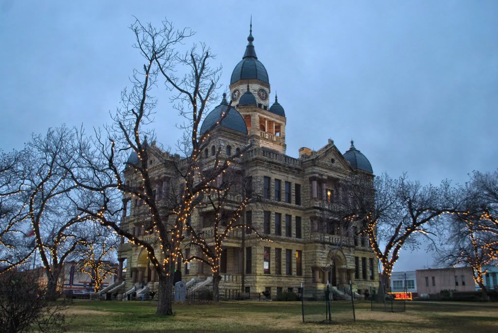
Doesn't do anything for me. Seeing the trailer in the back, the fencing in the front, the worn out grass, too much drab sky, and bad lighting. For this photo to work, a tighter crop by shooting closer up, nearer the trees, later at night, with a longer exposure, sharper focus, and more dramatic lighting (building uplights maybe?) would be a MUCH better scene. Not this: but maybe something like it?
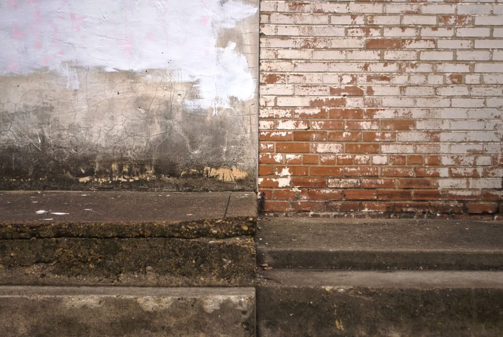
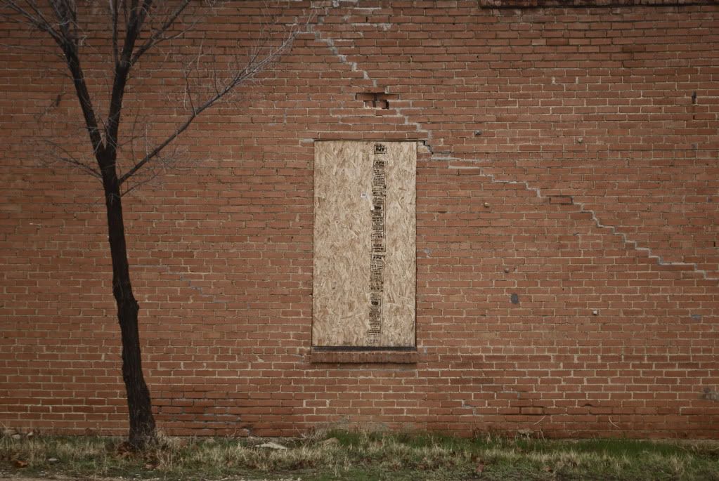
Too much. *Need to crop this one down, focus on the strong reveals in the wall, certainly cut out the manhole! *This wall would make a nice B&W detail shot perhaps
I like it. Could be immediately used in graphics projects, like Album art cover, magazine add backdrop, ect. Great stock photography photo
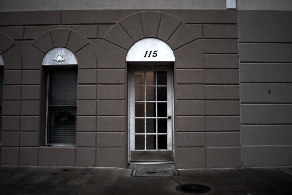
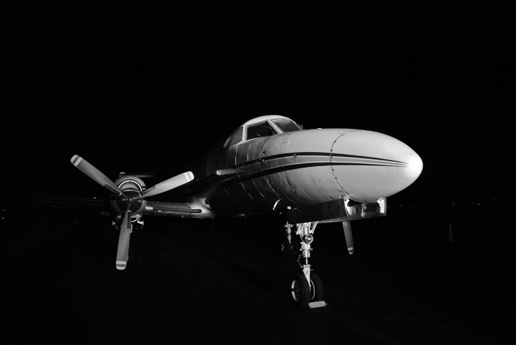
Good, but not great. Needs to be shot from a lower angle, and tigher crop! I'd bring the camera forward towards the plane and get the nose to look longer and more completely into the right of the frame. Not this, but something like it:

It's okay. I'd boost the saturation, textures, tone, sharpness, shadows, contrast, etc.... I'd crop it down much more too. But I like the tree to the left, it adds nice balancing interest.
Doesn't do anything for me. Seeing the trailer in the back, the fencing in the front, the worn out grass, too much drab sky, and bad lighting. For this photo to work, a tighter crop by shooting closer up, nearer the trees, later at night, with a longer exposure, sharper focus, and more dramatic lighting (building uplights maybe?) would be a MUCH better scene. Not this: but maybe something like it?
Too much. *Need to crop this one down, focus on the strong reveals in the wall, certainly cut out the manhole! *This wall would make a nice B&W detail shot perhaps
I like it. Could be immediately used in graphics projects, like Album art cover, magazine add backdrop, ect. Great stock photography photo
Good, but not great. Needs to be shot from a lower angle, and tigher crop! I'd bring the camera forward towards the plane and get the nose to look longer and more completely into the right of the frame. Not this, but something like it:
It's okay. I'd boost the saturation, textures, tone, sharpness, shadows, contrast, etc.... I'd crop it down much more too. But I like the tree to the left, it adds nice balancing interest.
t4rman
Adventurer
Thanks nwoods!
I can see what you are talking about on the first one. I'll bet the taking the photo from the base of the nearest tree or slightly behind it would yield a much better final product.
There was a light on inside the door on the second one. I was trying to bring that out more but am still learning to merge HDR.
I have taken plenty of photo's of planes. I am not sure why I took that one from that angle. My guess is I was trying to get the windows in the frame.
The last one was somewhat minimalistic. I pulled some of the color out but after hearing you input and looking at it again I agree.
john101477
Photographer in the Wild
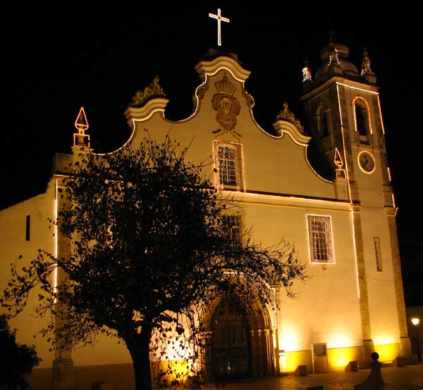
I took this in Fort Wayne Indiana on a very cold night. 30 sec exposure.
